Below is an image with three marketing emails I received from Banana Republic this year. The emails are from April, July and August.
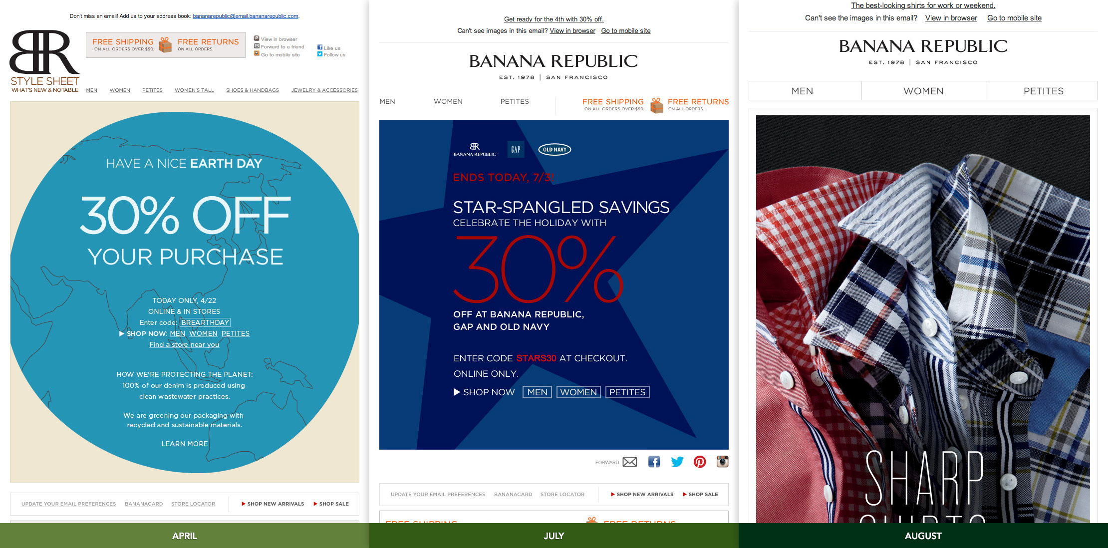
This series of emails illustrates evolving thought on email viewership:
- The first features a complicated header with all of their navigation and social media links.
- The second has a much simplified header with a four-link navigation. The social media icons are now lower on the page.
- The third has been further simplified — three large navigation buttons and a very tall image. The social media links are also absent.
It appears that they have pivoted on email marketing from desktop-first to mobile-first. The large, simple nav and portrait-sized image speak to this. And although it’s not a responsive design, it is one that will work across all platforms.
For those of us without a large marketing research department, Banana Republic’s changing email design indicates where users are going: mobile.